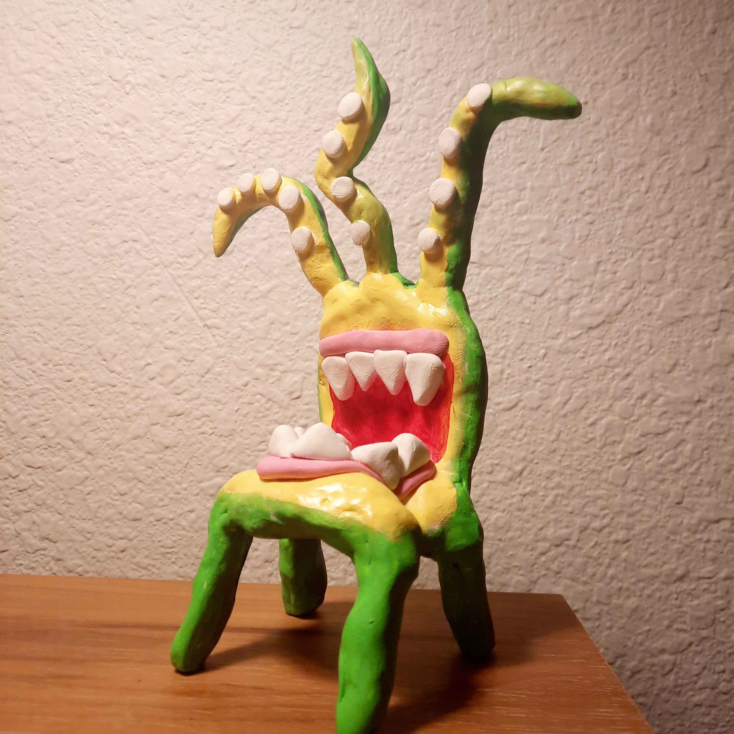
Hello! I’m Dr. Jeanette Laredo (@monsterscholar) and I’m a mixed media artist, educator, speaker and dabbler. This page is going to describe how I designed and built spiderweb salon’s entry for the 1st inaugural Denton Scary Chairy Orchard with the help of my fellow artists and friends. I hope that my gradual descent into madness can help you plan your own collaborative art project!
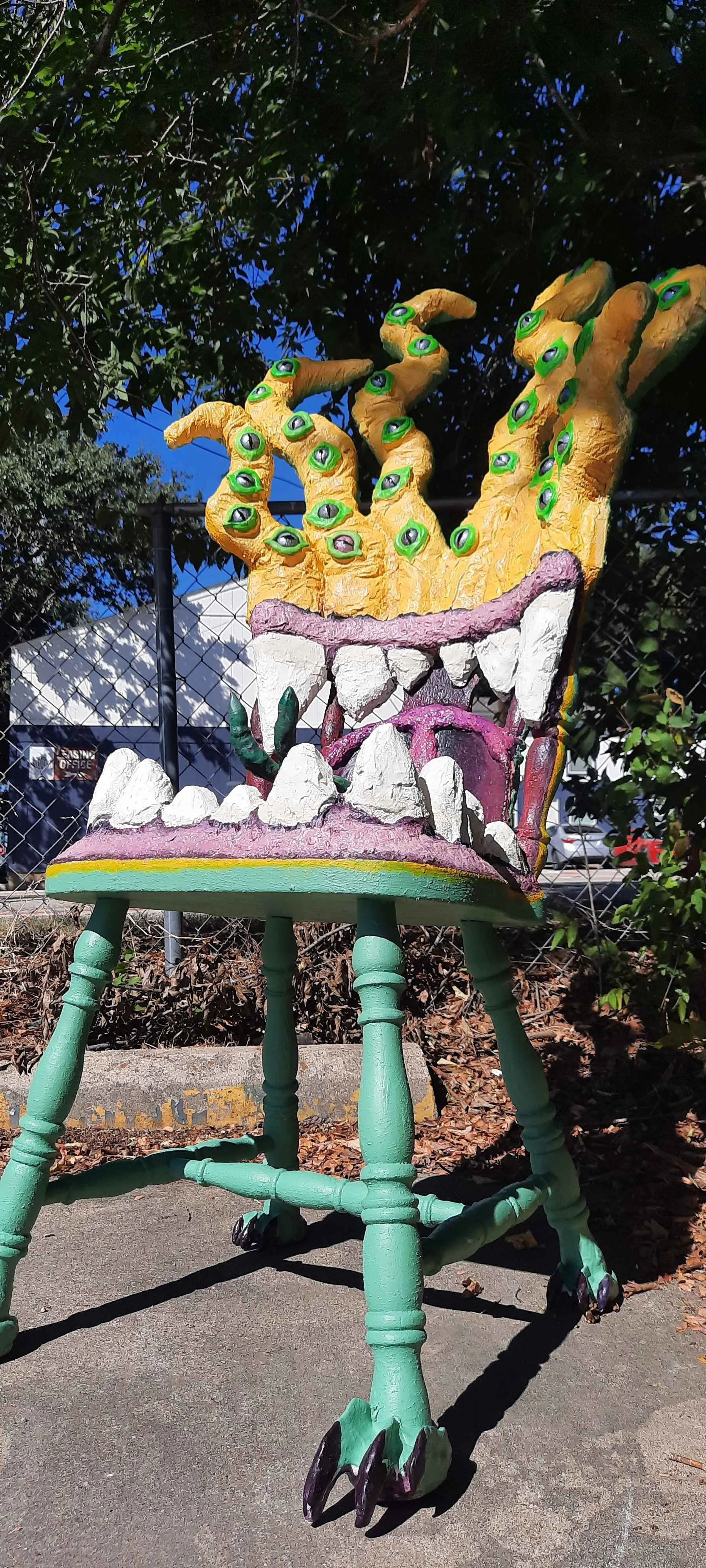
Shameus is every artist’s worst nightmare. Its gnashing teeth feed on your self doubt and insecurities, while its many eyes seek out your flaws. The only way to defeat Shameus is to come together and create art with others.*
People really responded to Shameus and his message. So much so that he swept the Scary Chairy Orchard awards, taking home accolades for the Most Clever Chair and the People’s Choice for a chair created by a group.
Designing the Chair
When I signed up for the Scary Chairy Orchard, I had no chair and no idea what I wanted to design. Indeed, I had no idea of the horrors that were to come.
I found the perfect chair on Facebook marketplace for $10 and sketched out a quick design on my phone of grabbing tentacles, gnashing teeth, a lolling tongue, and clawed feet.
Planning the Build
Once the chair had a design, I researched techniques and broke the build down into these steps: cutting cardboard, bulking out the shape with magazines, paper mache with shop towels, sealing with waterproofer, and lastly painting and details.
Sounds simple enough right? That’s what I thought. How very wrong I was.
In practice, these parts would have many more steps and take much more time than I initially realized. I have outlined those steps and the materials used for them below.
Cutting the Cardboard
Materials: Hot glue, cardboard, tooth picks, and pain.
After watching this Beetlejuice sculpture tutorial, I sketched out the shapes with paint pens on cardboard and cut them out with a box cutter.
To add height to the tentacles, I joined two pieces of cardboard using toothpicks and hot glue.
For the teeth, I scored the cardboard so it could bend using this tutorial. I then attached everything to the chair with hot glue.
I burned myself pretty badly on this step. I learned to never force a glue stick into a malfunctioning glue gun and never put your glue gun on high.
Bulking Out the Shape with Magazines and Installing Fairy Lights
Materials: Magazines, hot glue, dowel rods, solar fairy lights, masking tape, and hope.
I hot glued crumpled magazines to the structure to give it a three dimensional shape. The magazines started weighing down some tentacles, causing them to droop, so I hot glued on dowel rods to add some support.
I decided to put the eyes on the tentacles and used an awl to poke holes in the cardboard. I inserted clusters of solar-powered fairy lights that will later light up the eyes and secured them with masking tape.
I covered the clusters of fairy lights with tinfoil to protect them in the next step: paper mache.
Shop Towel Paper Mache
Materials: Shop towels, white glue, and mischief.
At this stage we moved the chair to spiderweb HQ so our community of artists could lend a hand during a series of open studios. Following this tutorial, we soaked shop towels in water and white glue soup and wrapped them around the structure to smooth out the shapes.
I learned that shop towels are very absorbent, so they need to be soaking wet when applying. I would also recommend cutting the shop towels into smaller squares to get around curves without creating gaps.
Adding More Support and Masonry Waterproofer
Materials: Wooden shims, masonry waterproofer, paper mache, and community.
My partner Ed screwed in some wood shims behind the tentacles for added support, and other spiderweb artists painted the entire sculpture with Drylok Masontry Waterporoofer to make it weatherproof.
A word of warning: Masonry waterproofer is very thick, so be prepared to use smaller brushes to get into hard to reach areas or add some water to the mix to thin it out.
After everything dried, I added some paper mache pulp to the base of the lower teeth to make the gums stand out a bit more and to the backside of the upper teeth to fill in the back of the chair. I would also add even more paper mache pulp to the back of the chair to conceal the wooden shims and screws for the next step: painting
Painting
Materials: Paint and acceptance.
I bought a can of white indoor/outdoor paint at the Habitat for Humanity ReStore then our paint mixologist Ed poured equal amounts into plastic food containers and tinted them pink, green and yellow with acrylic paint.
Artists at HQ painted the back of the chair green, the front yellow and the gums a bright shade of pink any dentist would be proud of.
Eyeballs, Eyelids, and Surprise Soldering
Materials: Shaker bubble domes, nail polish, air dry clay, soldering gun, drywall spackle, paint, and despair.
The eyes were made out of bubble shaker domes which I painted with nail polish and acrylic paint following this dragon eye tutorial.
Artists at HQ used air dry clay to sculpt eyelids for almost 30 eyeballs!
After they were dry, I popped the eyelids off the domes and Ed painted them with masonry sealant and neon green glow-in-the-dark acrylic paint. Once those were dry, I reattached the eyelids to the domes using tacky glue and they were ready to go over the fairy lights.
The tin foil that had been protecting the fairy lights until now was crusted with masonry waterproofer and paint. In my haste to free the lights from their foily prison I did the unthinkable, I cut a wire! This meant all the lights I had carefully installed would never shine.
It was the 11th hour. I was exhausted and devastated as I beheld the wreck of my disappointed hopes. That is when my hero Ed brought out his soldering kit. We reattached the wires, insulated them in hot glue and the lights blazed back to life.
Once all the tinfoil was removed, I attached the eyes with hot glue and filled in the gaps between the eyes and tentacles with drywall spackle which Ed painted once they were dry.
Throat, Mouth, Feet, and Tongue,
Materials: Polymer clay, tinfoil, cardboard, hot glue, liquid nails, paper mache, paint, and horror.
I made the throat by cutting out another piece of cardboard and scoring it so it could bend and fit along the curved back of the chair. Once that was hot glued in place, I added paper mache to fill in the back of the chair, and to the front to form the uvula and soft palate. Ed then painted these and the rest of the mouth with acrylics, turning those beautiful pink and healthy gums into a gaping maw of gore befitting a monster.
My friend and fellow spiderweb artist Marco gave Ed and I a big bag of assorted polymer clay for us to use for the feet and tongue.
Edward made the structure of the feet out of tinfoil then added the clay on top. He then proceeded to bake, paint and attach the feet to the chair legs using liquid nails.
I made the structure for the tongue out of tinfoil, but there wasn’t enough of any one color to cover the entire tongue.
So I chopped up a bunch of colors and put them in a sandwich bag with a few drops of mineral oil which softened the clay and allowed me to mix it together. I rolled out the clay on a sheet of plastic wrap and wrapped it around the tongue in sections, blending the seams with a dab of mineral oil. Then into the oven it went. I was planning on painting the tongue, but in mixing the clays I had created a grotesque marriage of lurid greens and ghastly reds that just worked.
Edward screwed the tongue into the base of the throat using wood screws which I concealed with paper mache. He later painted the base of the tongue to blend it into the mouth.
Final Thoughts
In hindsight, I would have given myself at least 2-3 months to complete everything and avoid rushing towards the end. But that was the was the result of me never having done any of these techniques before and this being my first collaborative project.
I learned a lot during this process about new techniques and materials, but I also learned a lot about coming together as a community to create something bigger than ourselves. Working on a collaborative project like this, I had to let go of the perfectionism and shame that often keeps me from creating art at all. Most importantly, I was reminded that the purpose of art is not to exhibit perfect technique or mastery, but to embrace the joy that can be found in the imperfect practice of creating art and connecting with others.
I hope that reading this has inspired you to keep creating your own art in community with other artists and to never let Shameus win.


*a note on the lore / zine!
while the build crew was busy helping jeanette with shameus’ creation, there was another project afoot: we had to develop LORE! because what’s a monster without a motive!? so one day during an HQ open studio a roomfull of brilliant spiderbabes pushed ideas around until we’d developed a bite-size story of shameus (and thusly named him SHAME-US), a terrifying monster who feeds on your confidence, your creativity, your dreams! DO NOT FEED THE MONSTER! though he can wreak havoc on our hearts & hopes, the good news is that it’s possible to fight him off, and it’s even easier with friends!
once we were satisfied with how our lore building had developed and had written the outline, i typed up the text on one of my trusty typewriters and formatted (cut & glued) it into a simple one-page zine so we could share our lil story & hopefully encourage others to keep fighting the good fight. i gave the original copy with the text to marco zavala, who drew the most excellent illustrations you see here. if you didn’t grab one of the 300 copies we made to hand out with our chair over the past month (we attached a little zine box to the big sign i made that said, “DO NOT FEED”), you can save and print the zine we made below! (& here’s a folding tutorial if you’ve never made a zine before!) shout out to jeanette for leading this fun project to collectively pursue together, and to all the talented spiderbabes who helped make it happen! xo cm


